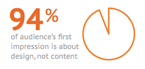
Sparkle like a dog with a fresh haircut. The quality of content is so important, but 94% of an audience’s first impression is about design.
To get the Compound Return newsletter in your inbox every month, subscribe here.
When I was growing up, we had the best dog in the world. (Sorry to burst your bubble – you probably thought your childhood dog was the greatest.) Anyway, Lucy was a Springer Spaniel mutt with a gentle, modest spirit. “Who, me?” her demeanor said. “Oh, I was just calmly hanging out over here. Don’t need a thing.”
Except when she got a new haircut. She was right to prance – she looked good, and she  knew it. The groomer would trim up her shaggies and tie a jaunty red handkerchief around her neck. I don’t have the data, of course, but I would estimate that she got 60% more smiles and pats in the days following her spa treatments.
We all know the feeling of walking out of the salon or barbershop with a nice new trim. As my sports-enthusiast brother-in-law says: Look good, feel good. Feel good, play good. Play good, win.
Putting aside the charming grammatical mishaps in that saying, it captures a truism: we feel energized when we look good. And for good reason – the world rewards beauty. Like it or not, appearance matters. Attractive people are paid more, in part because the world believes they are more competent. We rate people with nice teeth as more trustworthy (a point not lost on the good ladies of match.com, who list “nice teeth” at the top of their wish list). Even babies prefer attractive faces.
Now consider how that truism – looks matter – affects your content marketing. Research  shows that people evaluate web design in 0.17 seconds (you don’t even get a quarter of a second!). What’s more, a whopping 94% of your audience’s first impression is about design, not content.
So how well are you using that 0.17-second window to entice your audience? The meat of content – the message, the insights, etc. – is so important, but if you want people to get that far, you need to start with a nice haircut.
Consider freshening your content marketing appearance, with these five tips:
Appearance matters, and small updates to keep your content appearance fresh and current will help earn more eyeball time – and engagement – with your audience.
Looking for a writer to spruce up the 6% of your content marketing effort that’s left after design is accounted for? Reach out to learn more about how I can help you build your financial brand with engaging and human content.
Carolyn is a freelance financial writer with 15+ years of experience in financial services. She holds an MBA from the University of Chicago Booth School of Business and is a CFA charterholder. She writes from Washington D.C.
Posted By
Carolyn
Categories
Compound Return Newsletter, Content Marketing