A golden ratio to balance your content. A proven balance of proportions – the golden ratio – can help your content reach the next level.
To get the Compound Return newsletter in your inbox every month, subscribe here.
Recently I had dinner in a giant, 75-person-capacity bathroom.
Well, actually, it was a new small plates restaurant. Dinner was excellent – crispy duck confit, meaty fried tomatoes, a velvety peach ice cream.
But it felt like we were eating in a giant bathroom, because the entire restaurant was tiled with those large, shiny, trendy, white subway tiles.
I’m not an interior designer, but I do know what a bathroom feels like. I get what they were trying to do –that industrial-chic look. But it was too much. 100% tile = bathroom. It was a proportion problem.
Proportion puts us at ease: Meet the Golden Ratio
Getting the proportions right, on anything, is a tricky matter. Luckily, there are some secret codes that the design world (and nature) know about and use. One of these is called the golden ratio.
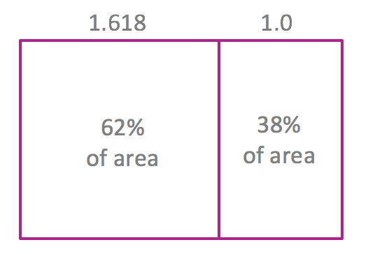
The golden ratio is 1.618:1. Huh? Basically, it looks like this:

When you turn it into two dimensions, it looks like this:
When you take the area of the square versus the smaller rectangle, the proportions break down to 62%/38%, roughly.
This ratio appears everywhere – math, architecture, art, nature – some researchers say the space-time continuum is governed by the golden ratio. It’s clear: these proportions work.
The golden ratio in content
Content marketers already use the golden ratio. Some designers say it’s the right balance of a web page – main section to sidebar. It’s also a pleasant balance of white space versus content.
I’d offer another guideline: the balance of copy to visuals. The ratio can go either way – for an article or paper, it could be 62% copy, 38% visuals, by space. For an infographic, it could go 62% visuals, 38% copy. It doesn’t really matter what the ingredients are, just that it’s a comfortable balance.

Reworking the balance
The problem is when you have extremes on either end. Too heavy on copy: eyes glaze over. Too heavy on visuals: you’re wandering into hieroglyphics territory. Both extremes ask your audience to work too hard.
Need easy ideas for breaking up copy? Try using pull quotes, icons to mark new topics, or even drawings or cartoons, a la The New Yorker. You can also pull out a single data point and visualize it – excellent ideas here. If you’re working on visual content, don’t be afraid to let some copy be integrated into artwork. The balance is just as important there.
If it’s good enough for the Great Pyramids and the Mona Lisa, it’s good enough for content marketing.
Looking for a golden ratio-ready writer? Reach out to learn more about how I can help you build your financial brand with engaging and human content.
Carolyn is a freelance financial writer with 15+ years of experience in financial services. She holds an MBA from the University of Chicago Booth School of Business and is a CFA charterholder. She writes from Washington D.C.
Posted By
Carolyn
Categories
Compound Return Newsletter, Content Marketing