When portions are bite-sized, they also become irresistible.
To get the Compound Return newsletter in your inbox every month, subscribe here.
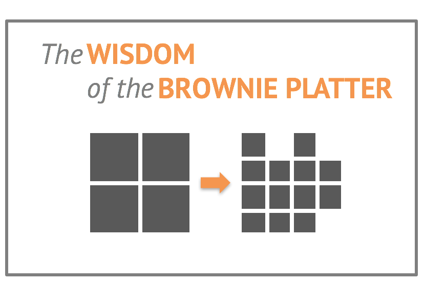
Aren’t brownies the best?* For about $4 and four minutes of active involvement, you can produce a simple and delicious treat that is almost universally loved. Which is why, if you come to dinner at my house one night, you’ll probably be served brownies for dessert.
 But the thing about brownies is, if you cut them too large, many guests will decline. “I shouldn’t,” they’ll say, or just “Oh, those look delicious, but no thank you.” Whether guests decline out of virtue for their waistline, or just to avoid looking gluttonous, too-large brownies are often left untouched.
Yet, if you cut the brownies up into little bite-sized pieces, no such problem. They vanish from the plate instantaneously. In fact, each guest may well eat the same amount as a large-cut brownie – but in bite-sized installments. Who says no to a 1”x1” piece? Then another? And another? The barrier to entry is much lower, for better or worse.
Bite-sized charts and graphs
This is what came to mind last week as I was flipping through an issue of Time magazine. I love Time for the news and discussion, but I especially admire the way its editors use graphics and visual data points – I often find myself ripping graphs out of issues to save in a folder for moments when I need chart-and-graph inspiration. (Time has won the prestigious Ellie award for design a number of times, most recently in 2013.)
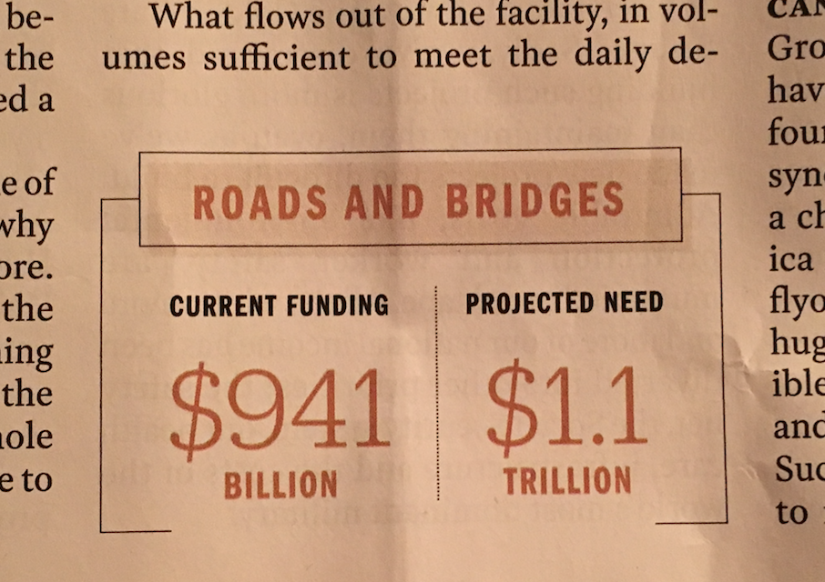
In this case, I was reading a multi-part series on infrastructure in America – where the weak points are, who has long-term investment plans, etc. The editors had sprinkled bite-sized visuals like this throughout the piece:

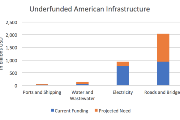
This is essentially just two points on a larger graph. For nearly all of us, wouldn’t something this be the first crack for visualizing this data?

It struck me how easily this Time approach would translate to financial content. Small graphs and visual data points – graphlets? chart bites? – can serve as mini landmarks for readers, guiding them through a piece while calling their attention to a key point. The mini format just makes them that much more palatable.
Portion control for visual data
Could your content benefit from the bite-sized approach? Here are a few ways to pare down graph portions:
Financial content is always connected to data and analysis. It lends itself perfectly to thoughtful visuals, and your audience will be happier for it, too. Need help building out visually-centered content? Reach out and let’s talk about your next data-centered project.
*Yes, I know the last newsletter was about chicken. And this one is about brownies. Hungry yet?
Carolyn is a freelance financial writer with 15+ years of experience in financial services. She holds an MBA from the University of Chicago Booth School of Business and is a CFA charterholder. She writes from Washington D.C.
Posted By
Carolyn
Categories
Compound Return Newsletter, Content Marketing